The Design Sommelier Blog: Sip something Beautiful
It’s 2021—Hooray!! How are your resolutions shaping up?
Remember when we punched that big ol’ RESET button, clinked glasses, promised to take better care of ourselves, and resolved to finally DO something with that those same 4 walls we’ve been staring at all year? Don’t give up yet! C’mon friends, it’s only February. You can do this!
Let’s start with some fresh color. Ready, GO!
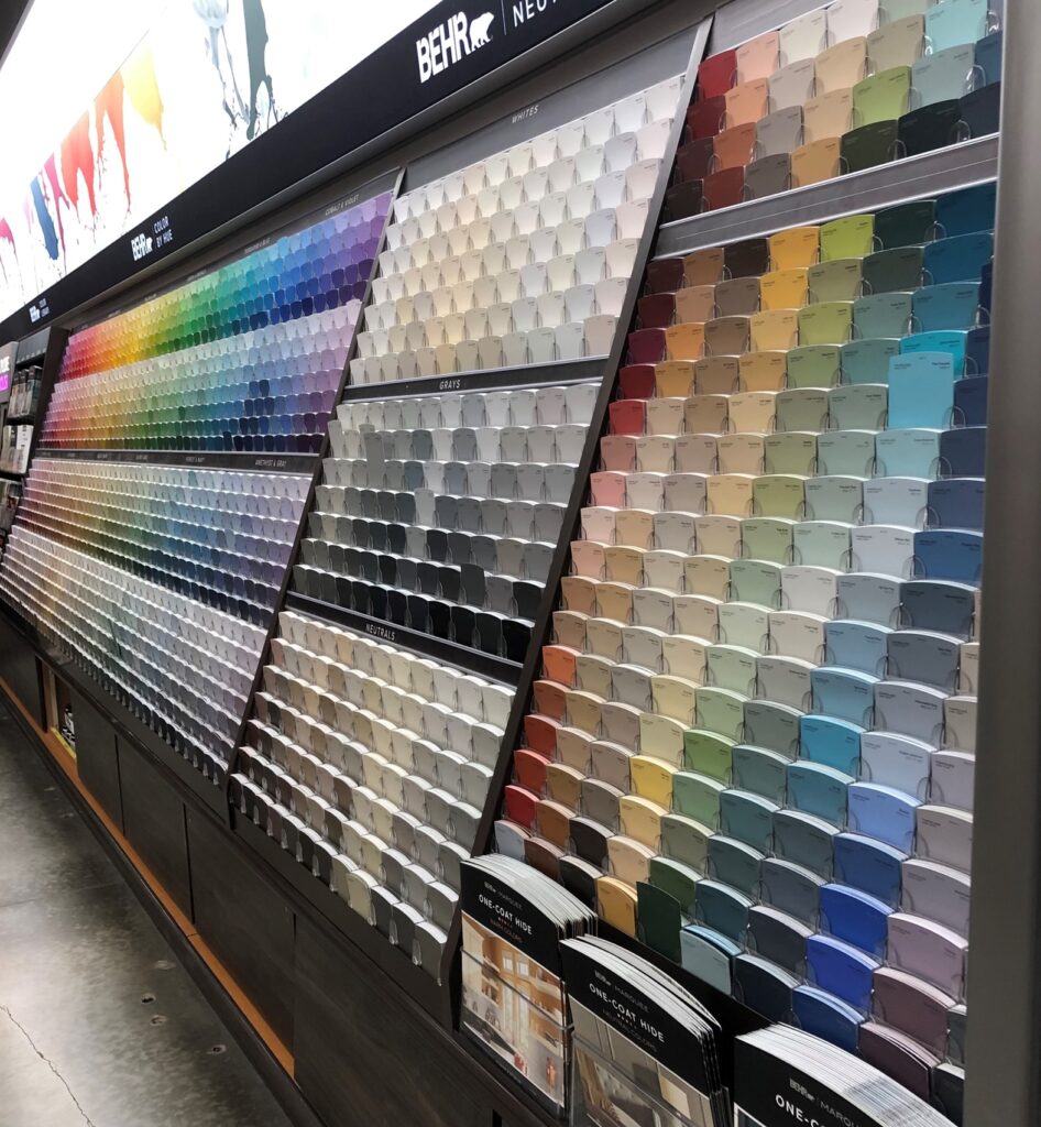
Hm. I see your point… let’s narrow this dizzying decision.
Fortunately, pro Color Theorists have already done this work for you, analyzing a myriad of consumer markets, social indicators, and trend forecasts to determine that uniquely, unanimously, universally perfect shade for your 2021 project— the Color Of The Year!
And this year, the clear winner is… Urbane Bronze, Aegean Teal, Contemplative, Transcend, Ultimate Gray, Illuminating, and A.I. Aqua.

Hm again. Yes, EACH of these seemingly unrelated shades has been selected as 2021’s Color of the Year (COTY).
You’re looking at the “hero” colors from the largest paint manufacturers favored by designers (Sherwin Williams, Benjamin Moore, Pratt & Lambert, and PP&G), as well as influential color systems Pantone and Coloro, listed in order of their COTY shown above. If you’re counting along, you’ll note Pantone chose a PAIR of colors, in basic gray and intense yellow. And there’s plenty more not shown—dozens of manufacturers crown their own color queen annually.
Valspar and Behr, mainstay brands of Lowes and Home Depot, didn’t bother naming a singular COTY, but rather a handful of seasonal shades. Now you can easily stay on top of trends by repainting your house every month! (Sorry, not funny.)

Expect to see these colors popping up everywhere from graphics to galoshes to kitchen gadgets. It’s 2021 and dusty is the new clean.
If the pros can’t even agree on whether the hot color should be a cool pastel, white is right, or off-black is a bright idea, how should the average DIYer make sense of it all?
Once again, the Design Sommelier’s best advice boils down to: make yourself happy. When you talk about taste making, everyone’s palette is different.
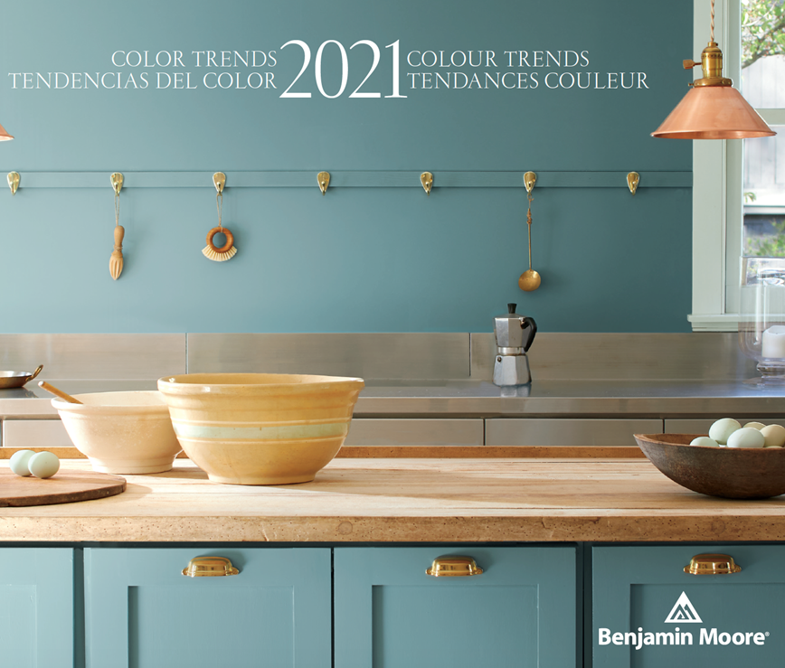

People are not monochromatic. There is no single “right” color answer for every person or place. Just like you don’t want to wear the same yoga pants every day wherever you go…
(er, bad example)
… or drink the same cabernet with your steak and banana muffin…
(well, most of us wouldn’t)
..there is no haircut that flatters every face, no chair that is comfortable for all butts all day, and no ONE color for your kitchen cabinets that magically makes you cool from January to December.
If picking colors is a choose-your-own-adventure, what’s the point of naming a COTY?
By analyzing consumer buying trends, and funneling their marketing efforts toward the most promising themes, manufacturers hope to stay ahead of the trend curve, and help pave it in colors the public is happy to follow. Here’s why we end up with lots of different versions:
Each of these companies is appealing to a different primary market segment.
Designers must approach color in differently in spaces devoted to work, exercise, retreat, or (distant) socializing.
Brands most likely to be purchased for residential use are selling comfort in a can right now. After a fearful year anchored at home and grappling with health concerns, predictions for the most popular interior colors and décor finishes include:
- Fresh seaside colors, representing the calming retreats and vacations we crave
- “Healthy” greens and warm earth tones rooted in nature
- Misty sunrise colors that quietly soothe our worries
- Saturated brights and jewel tones for extra cheer and bounce
- Deep grounding neutrals that can read as stable, powerful, or mysterious
Meanwhile, global companies anxious to recover from 2020’s economic slump are rushing toward the future. In commercial contexts, high-energy brights are more likely to take center stage, representing hope, innovation, and the growth of AI. These attention-seeking colors are kept in check with a stable gray. They still works in some residences, but it’s a familiar balance of power that resonates with the get-back-to-business crowd.
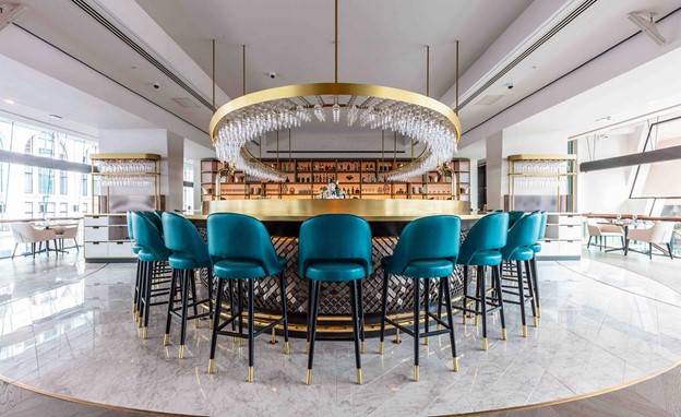
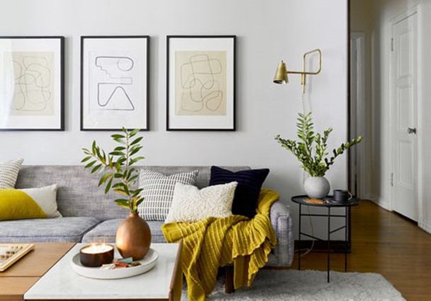
Yes, it’s mostly marketing hype and storytelling, but there is science behind it.
You already know specific colors promote certain moods. However, perception of color changes based on environment, application, quantity, color context, and a complex collection of individual and cultural associations. In other words – your favorite fresh fern-colored velvet is your aunt’s awful avocado refrigerator. If you want your aunt to visit more often, maybe don’t upholster the whole living room with it. And don’t let Pantone tell you it’s gotta be yellow, if you just want to relax.
The pros and cons of virtual abundance.
With a cornucopia of marketing images and social media trendspotter feeds at your fingertips, gauging trends is easier—and more overwhelming— than ever. Spend time exploring the big picture online before investing IRL. Product and paint retailers like Benjamin Moore are developing better room visualization tools to help you pick a fave with less stress.
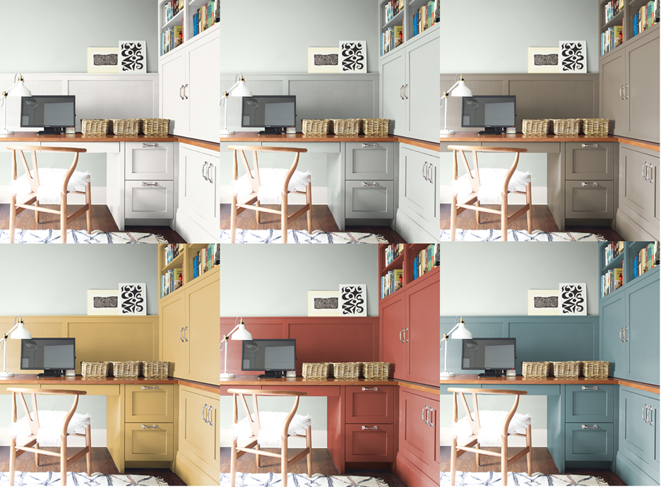
At MDG, we still lean toward an abundance of neutrals, with injections of color that are easy to mix in and out as trends shift again. Even the ultimate “timeless” combo of black and white got overexposed in 2020, so we expect more interest in softer, warmer tones, and those fresh, plant-based greens, mixed in with tons of natural textures.
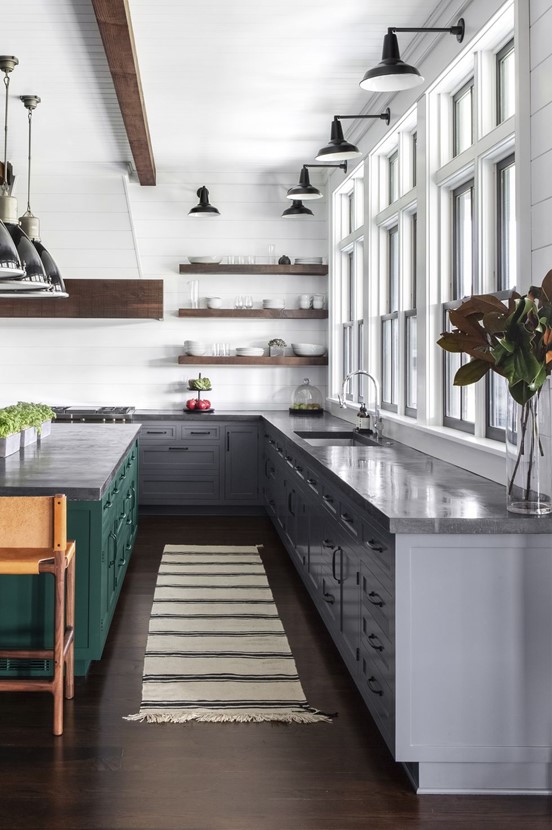
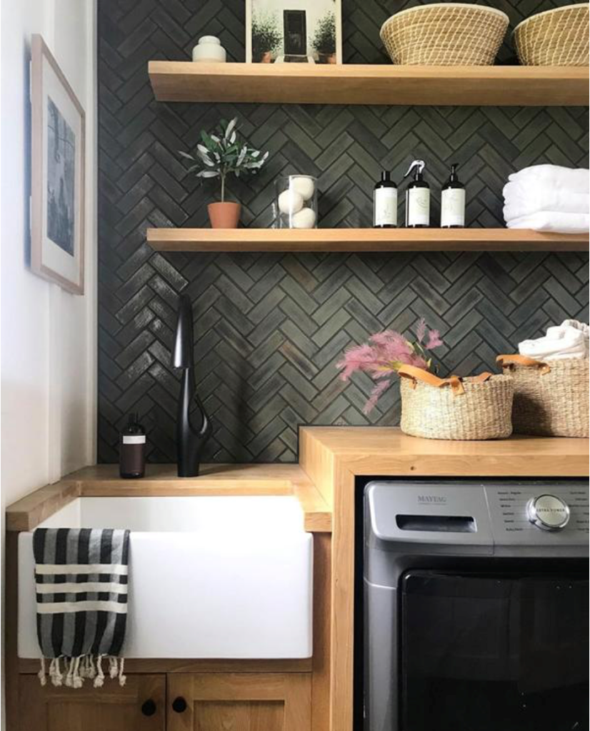
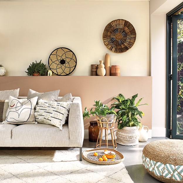
The trend cycle continues to accelerate, so go easy. Remember when you finally committed to update old beige walls to gray, only to discover Pinterest awash in white, and your youthful crush, Millennial Pink, has already retired?
Take color funeral announcements with a grain of salt. Gray, mauve, and –yes, pressed powder beige—all made the team this year. Whether you deem terracotta peachy or the pits, you just might change your opinion as it saturates the market.
With all the variety out there, it seems the only color you won’t see on the 2021 forecast is red. Unless… you’re reading the Design Sommelier’s forecast for happy hour.
Cheers,

Howdy, i read your blog occasionally and i own a similar one and i was just curious if you
get a lot of spam remarks? If so how do you stop it, any plugin or anything you can advise?
I get so much lately it’s driving me insane so any support
is very much appreciated.